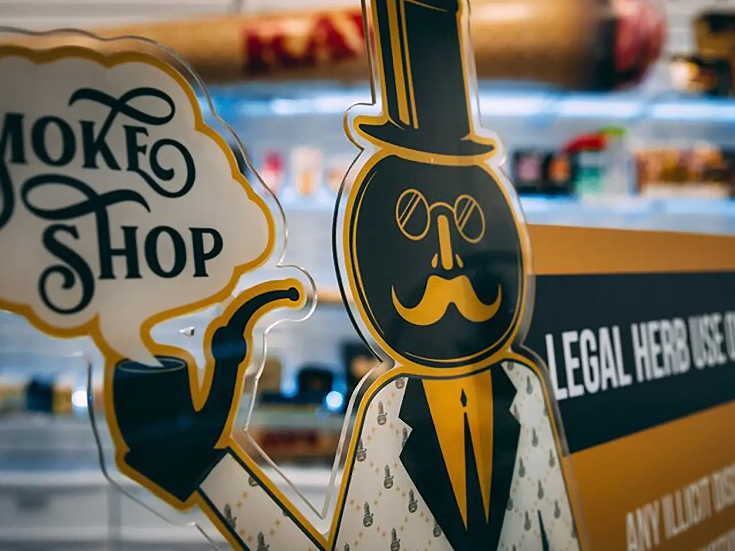
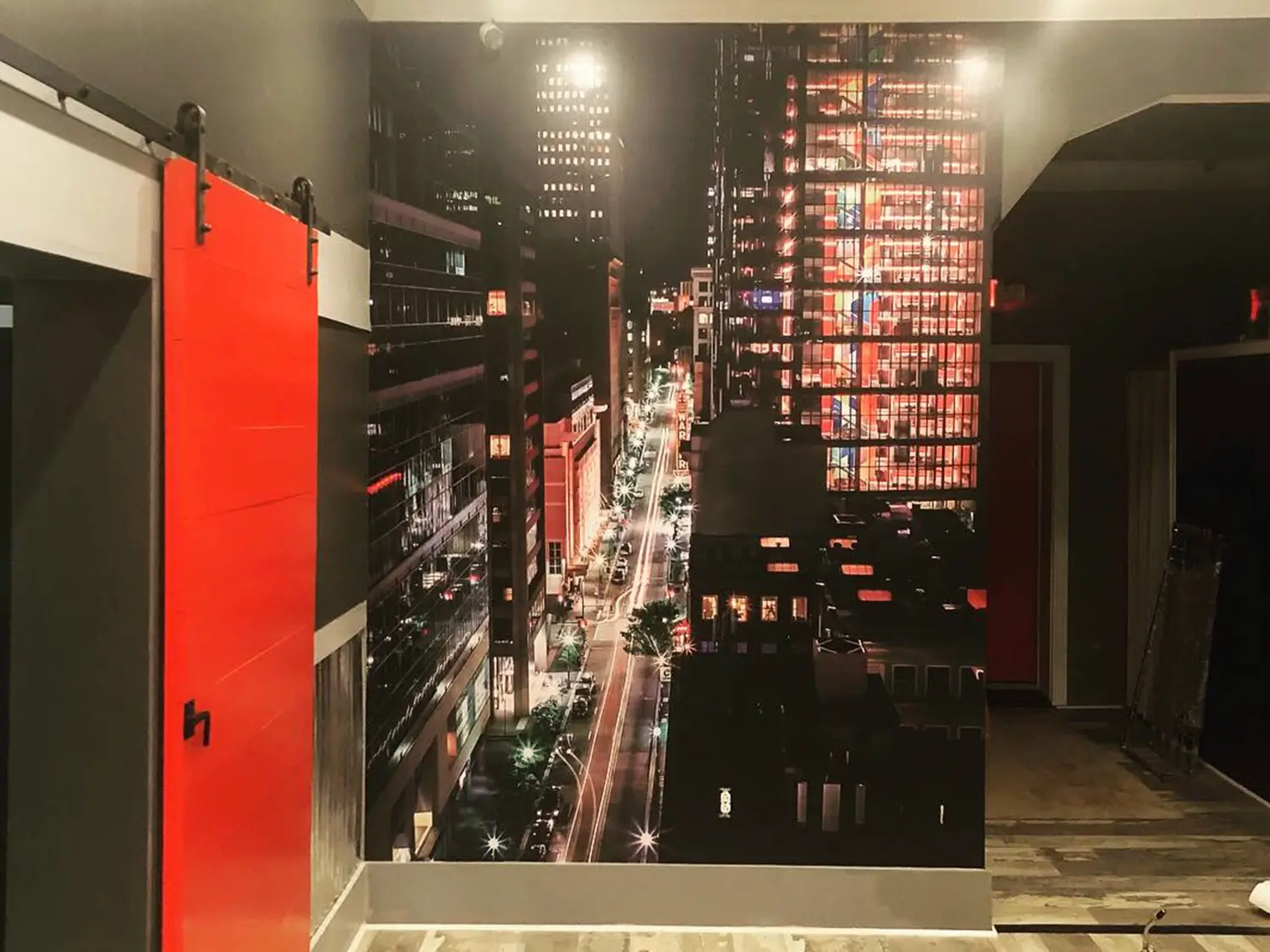
About 2 years ago we did their first Keepin’ It Glassy location on McKnight Road. So when it came time to open Keepin’ It Glassy’s 2nd location in Washington, PA, we were again summoned to the task of using our print super powers to bring their store to life.
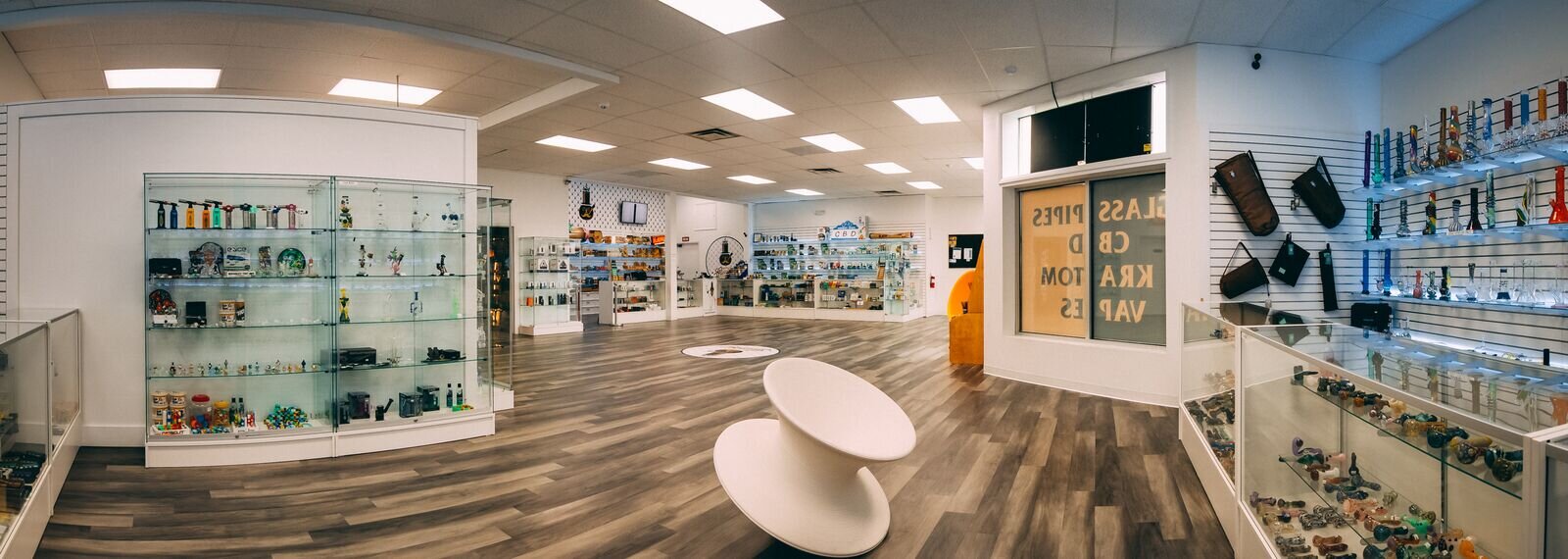
EXTERIOR OF KEEPIN’ IT GLASSY
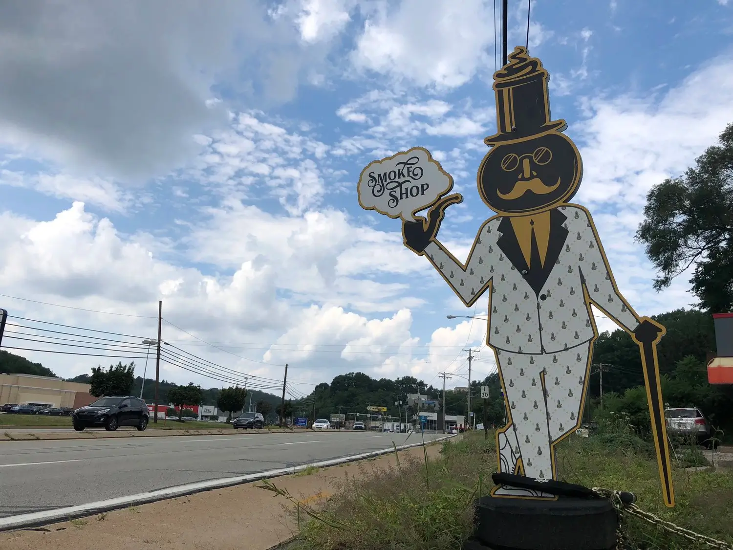
Keepin’ It Glassy sits on a busy intersection on route 19. Our goal was to bring awareness to the new location while creating a welcoming entry way. The “Now Open” sign sits right on Route 19 to catch the passerby’s eye while the black and yellow window pulls them into the store’s physical location. Using these as attention grabbers, the connection is easily made and everything else draws you towards the main entrance.
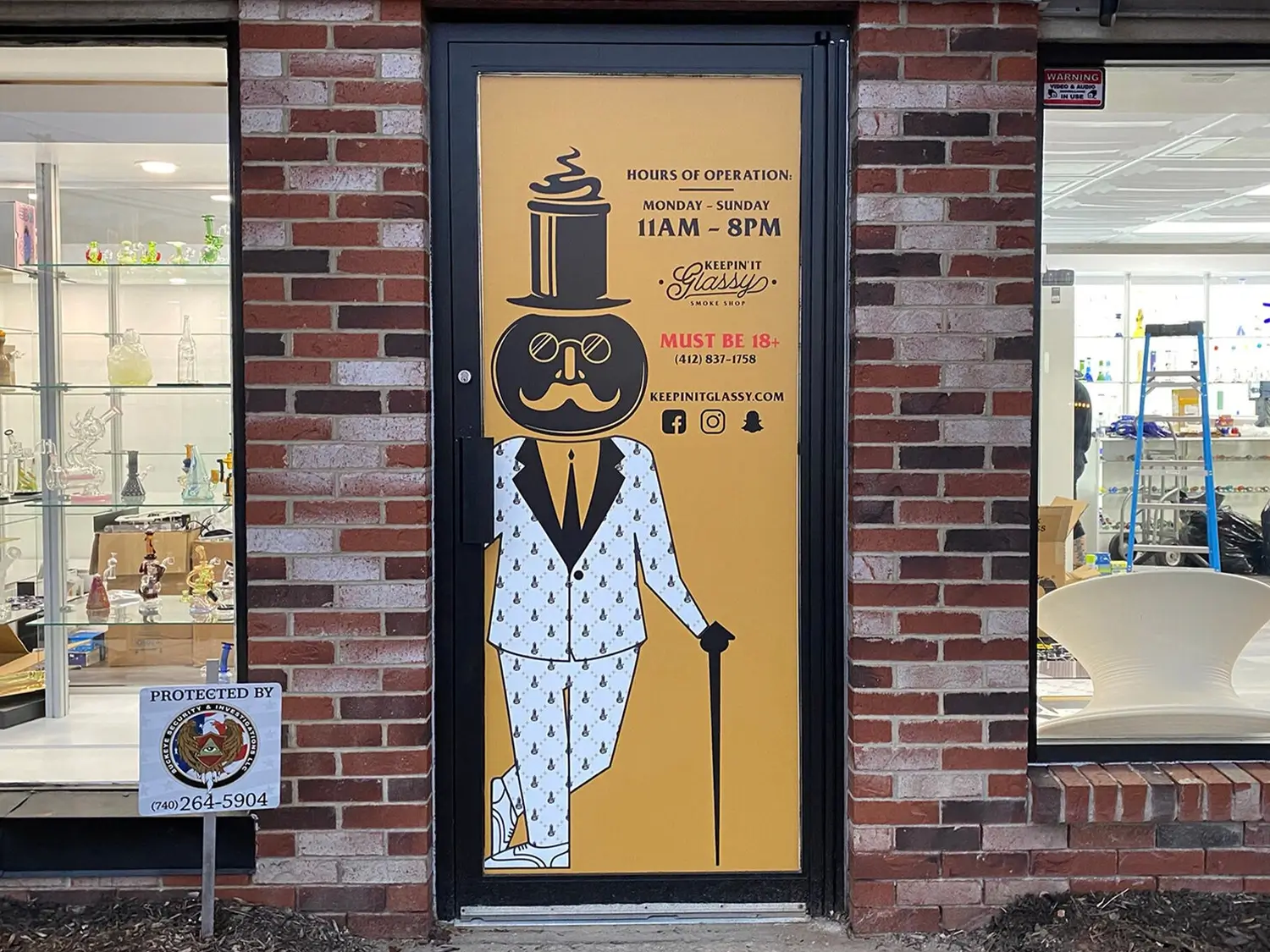
We used a 60/40 window perf on the main door entrance to create a cool effect. From the exterior you see Mr. Glassy but from the interior, you can easily see right out into the parking lot. [PICTURED BELOW] In contrast, the black and yellow design on the windows is printed directly to vinyl and completely blocks the view.
The Now Open sign is 2 sheets of corrugated boards requested to replace the real estate sign previously in its place advertising the available space. Prior to this shop opening, the top part of the sign said “Coming Soon” and we later custom printed the “Now Open” when the doors for the shop finally opened.
FLOOR STICKER
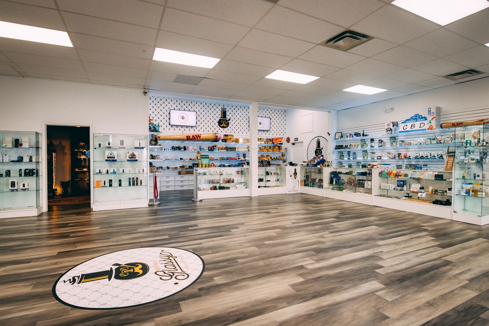
The floor sticker is a fan favorite at their McKnight Rd location so we brought it back! It’s a 5’ diameter vinyl with an anti-skid lamination. Built to take a beating and still look great for years to come.
WALL WRAP
When you first walk into Keepin’ It Glassy, one of the very first things you will see is the massive wall wrap behind the main counter. This features a custom pattern specifically created for Keepin’ It Glassy by Super Deep Creative.
CUSTOM SIGNS
Proper etiquette seems to be understood within the community but can be an issue with new shoppers. We proposed the idea of these custom etiquette signs to capture the attention of these newcomers in hopes of deterring the wrong use of language while being a patron.
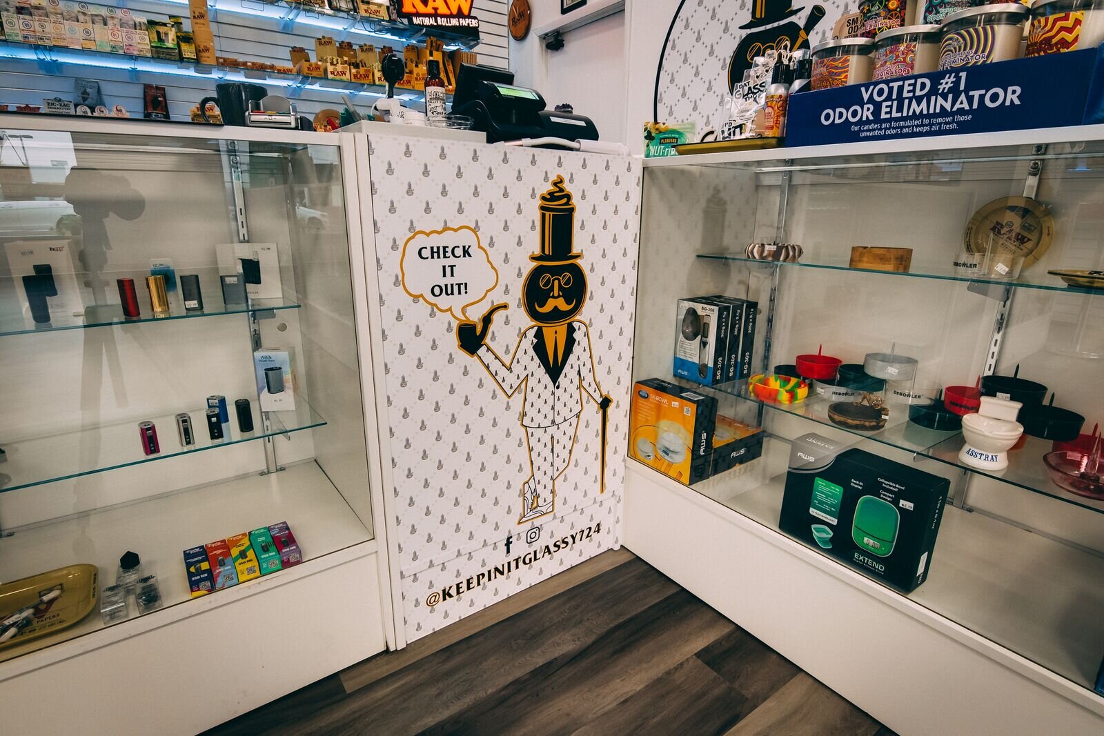
COUNTER WRAP
“Check it Out”, get it? As opposed to keeping this a plain white counter, we wanted to have some way to make it stand out and add purpose.
STICKERS
Each of their locations feature these custom stickers with characters created by Super Deep Creative. These are 4” custom die cut stickers and they are able to be used wherever you’re wanting to stick them as they can withstand the elements.
POSTCARDS
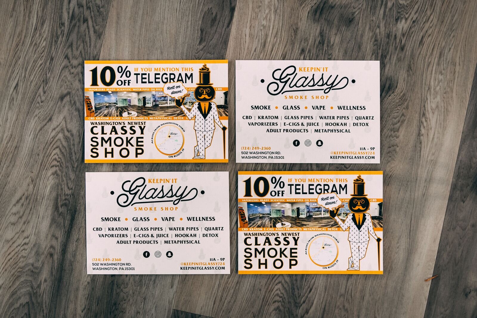
These a 5” x 7” glossy postcards with ALL of the information about the store on there to spread throughout the Washington community.
BUSINESS CARDS
Simple takeaways with contact information about the store, its location and digital networks for connection. Standard 2’“ x 3.5” glossy cards.
If you’re in need of any help with a project, contact us and let’s get talking!
